The Atlanta Hawks’ New Uniforms Are Not Good. They Are Not Very Good At All
After the Atlanta Hawks gloriously redesigned their court, featuring the return of the team’s old-school “Pac-Man” logo at midcourt, anticipation of their new uniform reveal was palpable. Would they integrate some old-school flair into a modern look? Would Pac-Man be displayed prominently? Would . . . oh, wait, here they are, and they are strange.
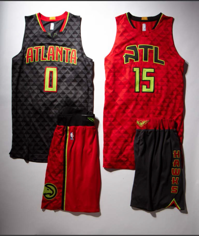
The Hawks’ new unis resemble a piece of fabric that has been run over by a 4-wheeler, leaving tire tread marks all over it. Or perhaps a backgammon enthusiast was hired to complete the redesign. Either way, they aren’t good.
RELATED: The Clippers‘ New Uniforms are Super Lame
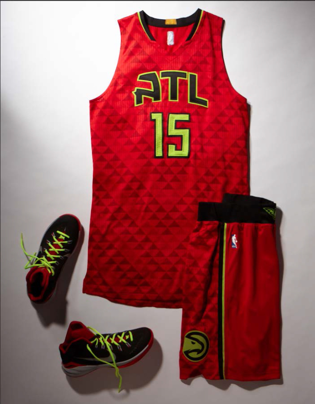
The red alternate uniform is the least offensive, but the neon green coloring used for the numbers and to outline the letters is a head-scratcher, since neon green is nowhere to be found in the Hawks’ original color scheme. Another “where did that even come from?” aesthetic is the triangle pattern on the jersey and on the sides of the shorts. Like, why? For what reason? Who hurt you?
And what about that weird character preceding the letters TL on the jersey? Is that the letter “A” from some mysterious new font called WRENCH?
Fortunately, the Pac-Man logo (i.e., hawk head) appears on the shorts of the home and alternate uniforms, and the shorts that go with the black version look pretty legit, with “HAWKS” down the side. But that’s all that’s good here. As former Hawk Dikembe Mutombo would say: “No, no, no.” Check out more photos of the new threads below.
RECOMMENDED FOR YOU
MOST POPULAR
The Atlanta Hawks’ New Uniforms Are Not Good. They Are Not Very Good At All
After the Atlanta Hawks gloriously redesigned their court, featuring the return of the team’s old-school “Pac-Man” logo at midcourt, anticipation of their new uniform reveal was palpable. Would they integrate some old-school flair into a modern look? Would Pac-Man be displayed prominently? Would . . . oh, wait, here they are, and they are strange.
The Hawks’ new unis resemble a piece of fabric that has been run over by a 4-wheeler, leaving tire tread marks all over it. Or perhaps a backgammon enthusiast was hired to complete the redesign. Either way, they aren’t good.
RELATED: The Clippers‘ New Uniforms are Super Lame
The red alternate uniform is the least offensive, but the neon green coloring used for the numbers and to outline the letters is a head-scratcher, since neon green is nowhere to be found in the Hawks’ original color scheme. Another “where did that even come from?” aesthetic is the triangle pattern on the jersey and on the sides of the shorts. Like, why? For what reason? Who hurt you?
And what about that weird character preceding the letters TL on the jersey? Is that the letter “A” from some mysterious new font called WRENCH?
Fortunately, the Pac-Man logo (i.e., hawk head) appears on the shorts of the home and alternate uniforms, and the shorts that go with the black version look pretty legit, with “HAWKS” down the side. But that’s all that’s good here. As former Hawk Dikembe Mutombo would say: “No, no, no.” Check out more photos of the new threads below.

